“The minimalist auteur who put a jagged arm in motion in 1955 and created an entire film genre……and elevated it into an art” – New York Times
Whom might this refer to? One of the greatest graphic designers of the mid 20th century and master of film title design – Saul Bass.
The Design Museum featured an exhibition of his work in 2004 and, boy, I wish I had gone – I think I was knee deep in keeping one toddler under control and pregnant with another.
To set the scene , 1950’s movie title sequences were forgettable, in fact they generally kept the curtains closed until the film started.
But in 1955, in the film The Man with the Golden Arm, projectionists were asked to pull up the curtains before the film started – and at that point a profound relationship evolved – a relationship which forged creative art and film, and elevated title scenes into an integral part of the film industry.
Saul Bass was already an established graphic designer.Born in 1920, he grew up in the Bronx and studied at the Art Students League in New York.
Bass was introduced to the Bahaus school of thought by a Hungarian graphic designer, Gyorgy Kepes.
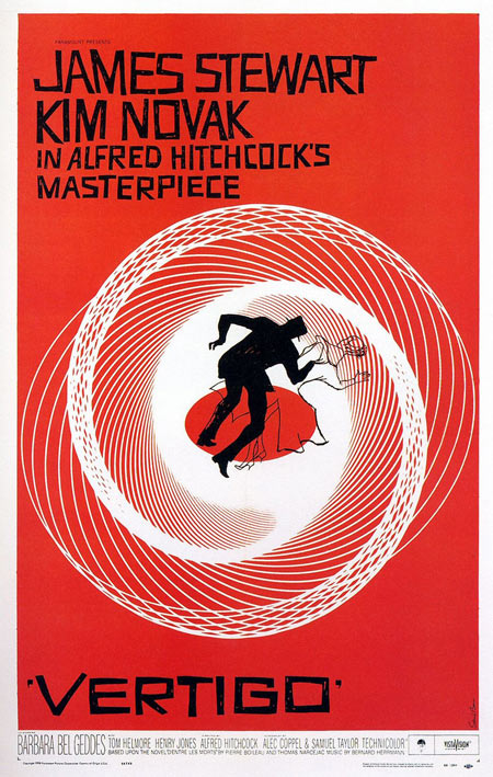
Bahaus, influenced by modernism, emphasised a lack of ornamentation – stressing the importance of the function of an object. You can clearly see the influence of this theory in Bass’s work – the cut out arm in The Man with the Golden Arm, the teardrop in Bonjour Tristesse and the swirls in Vertigo.
His approach, as described by Martin Scorcese was “an emblematic image, instantly recognisable and immediately tied to the film”:
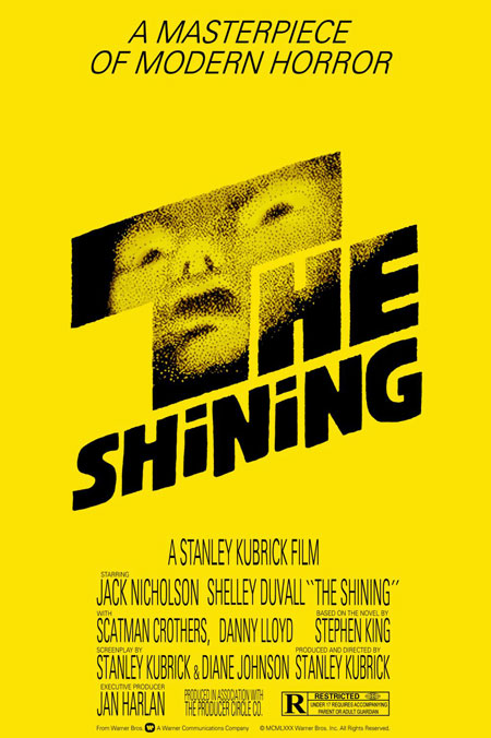
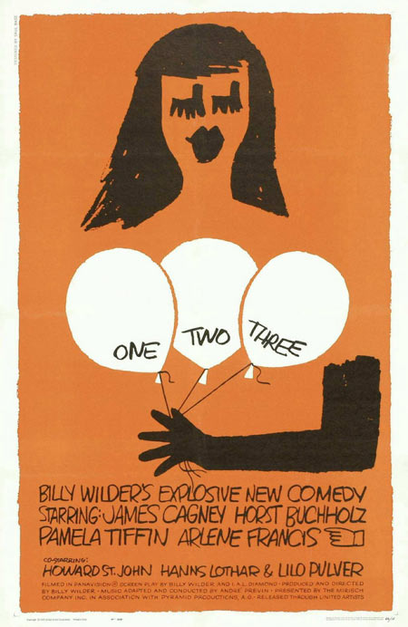
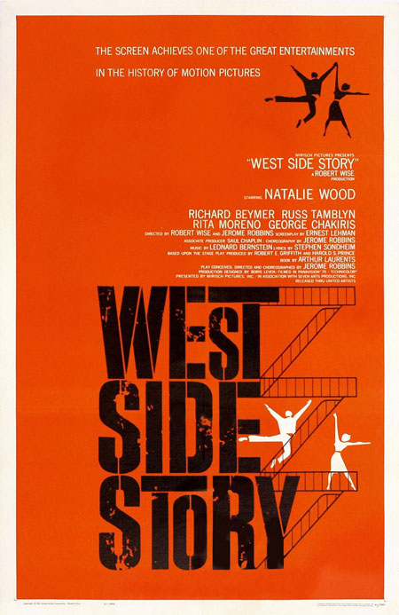
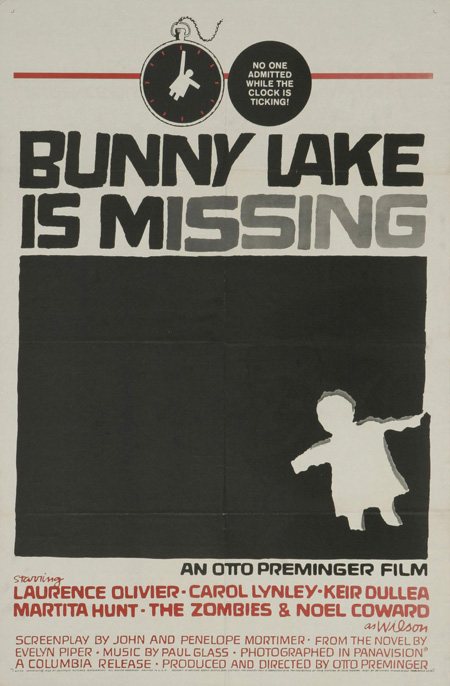
Bass collaborated mostly with Alfred Hitchcock, Otto Preminger and Martin Scorcese – creating some of the most famous and chilling title sequences – all powerfully minimalist:
In true Mad Men style, Saul Bass didn’t just leave his mark on cinema. Returning to commercial graphic design in 1974, Bass threw that – one object, one function – approach into some pretty hefty corporate identities:
Warner Communications
United Airlines
Bell
I think Sterling Cooper Draper Pryce could do with a Saul Bass right now, don’t you?





I based my end of year exhibition poster on ‘The Man with the golden arm’ when I was at Uni. I painted it along those cut out arm lines. I loved the style.
You kept that one quiet! Did you take any photos?
No, but I must have it buried away somewhere! I’ve no idea where!!