There is a reason why I have a crush on Harper’s Bazaar España, apart from Sandra Suy’s beautiful illustrations. The attention to the layout of text, in relationship to images, is really quite something.
I confess I am a terrible magazine junkie, and it may simply be the case that I am so used to reading the same magazines, I’ve become desensitised to their layout. But the creative, contoured use of text in this publication has really hit me between the eyes and feels distinctly familiar.


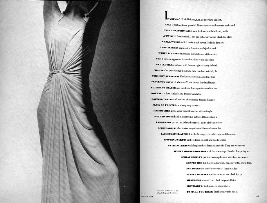
The reason it might strike you as familiar is because of Alexey Brodovitch, the art director of Harper’s Bazaar (US) who revolutionized magazine publishing with his use of double spreads and clever typography in the late 1930’s through to the late 50’s.
“Brodovitch sometimes manipulated text to comply with the constraints imposed by the photograph. He explored various typographic possibilities to see how they could work with the content of an image; he seems, for example, to have designed the contour of a block of text to harmonise with the outline of a dress photographed by George Hoyningen-Huene (15March 1938). At this time he was also performing similar experiments with the photographs of Man Ray. One or more dropped initials, in black or in colour, would harmonise the composition of the text and create a counterpoint to the image”. (Alexey Brodovitch, Gabriel Bauret)

 All I can say is whoever is doing the España layouts, keep on doing them. Because I’m loving them, even if my spanish is a bit ropey, and I’m sure Alexey would be rather thrilled.
